Considering Colour Blindness
28 April 2026
This blog post is written by Jordan Lloyd, a Learning Designer in the Digital Education Team part of the Learning and Teaching Academy.
Colour blindness can often be overlooked in conversations about accessibility in higher education, yet it affects a significant portion of the student population. Approximately 1 in 12 men and 1 in 200 women experience some form of colour vision deficiency. This accounts to 1250 Cardiff University students.
In a university setting, where visual presentation of information plays a key role in teaching and learning, failing to consider colour blindness can create barriers that impact understanding, participation, and academic performance.
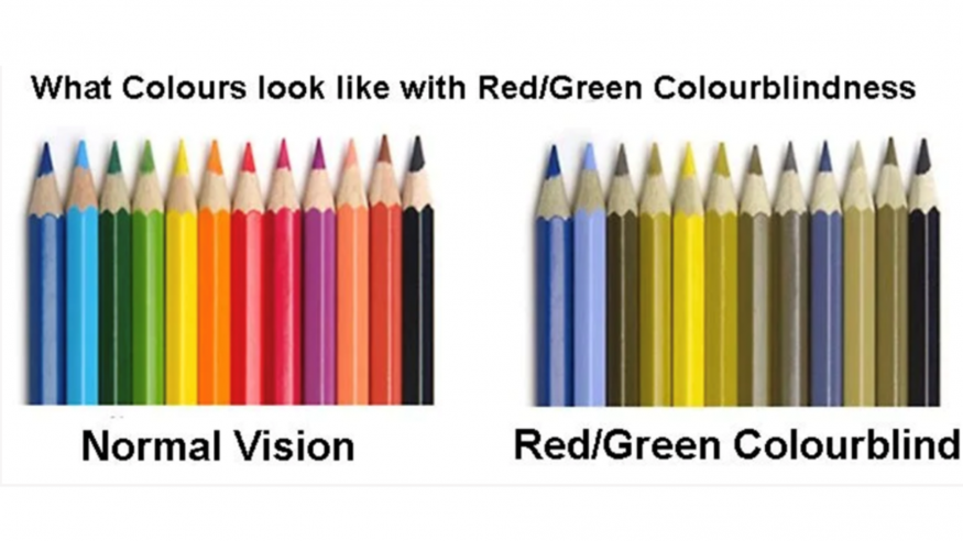
Colour blindness does not mean seeing the world in black and white. Most individuals with colour vision deficiency struggle to distinguish between certain colours, commonly red and green, or blue and yellow. While this may seem like a minor inconvenience, the implications in academic environments can be substantial. Lecture slides, charts, diagrams, laboratory materials, maps, and even digital learning platforms frequently rely on colour as a means of conveying information. When colour is used without thoughtful design, students with colour blindness may miss critical details or misinterpret content entirely.
Universities are increasingly committed to inclusivity and equitable learning experiences. However, accessibility is not only about physical spaces or assistive technologies; it also involves how information is presented. Designing learning materials with colour blindness in mind is a simple yet impactful way to support a diverse student body. Importantly, these adjustments benefit everyone, not just those with colour vision deficiencies.
One of the most common issues arises when colour is used as the sole differentiator. For example, a graph that distinguishes categories using only red and green lines may be clear to some students but indistinguishable to others. Similarly, highlighting key concepts in colour without additional visual cues can make important information effectively invisible. Good design practice involves pairing colour with patterns, labels, icons, or text descriptions. A chart that uses both colour and distinct line styles becomes accessible to all viewers.
What actions can you take?
- Avoid Colour-Only Coding: Never use red and green together to highlight data, as these are common confusions (along with blue/purple and yellow/green).
- Provide Textual Alternatives: Use labels, patterns, or symbols in graphs, charts, and maps to differentiate data, rather than relying solely on colour-coded legends.
- Text Formatting: Increase font weight and use bold text for highlights, as bolding improves legibility for those with visual impairments.
- Accommodation in Assessment: Ensure exam materials are accessible, such as providing greyscale versions of colour-dependent diagrams.
- Technology: Use digital tools to check materials, such as colour-blind simulators.
Beyond technical adjustments, colour blindness awareness is also about empathy and understanding. Many students may not disclose their condition, either because they are unaware of it or reluctant to request accommodations. By proactively designing inclusive materials, educators reduce the burden on students to self-advocate and foster a more supportive learning environment.
Ultimately, colour blindness-aware design is not about limiting creativity or visual appeal. Rather, it encourages more thoughtful, effective communication. When we consider colour blindness in accessibility strategies, it is a meaningful step toward truly inclusive education—where all students can engage fully with learning materials, without unnecessary obstacles.
Want to discuss Colour vision deficiency and accessibility strategies further?
The Learning and Teaching Academy are here to help, just get in touch: [email protected]