The Multiple Joys of Universal Design
6 February 2024
I was Programme Director for the Executive MBA in Cardiff Business School for 5 years. It was a big responsibility. I had to put a lot of time into promoting the programme to the outside world – open days, individual meetings with potential candidates, shout outs at Breakfast Briefings etc. There was also actually managing the programme day to day, co-ordinating modules with module leaders, responding to group student feedback as well as the different individual needs of the Executive MBA student cohort. Given the part-time nature of the course, and the fact that students missed modules, took ‘Interruptions of Study’, delayed starting their dissertations etc. it all meant that there was never just one year group to deal with, there were multiple years of students that required attention at any one time.
I think the most pressing of all the challenges however was making sure that we had secured, in sufficient numbers, an experienced, varied, dynamic cohort to start the programme each year. Even though it’s worth every penny, the programme does cost a lot of money and taking on a Masters, even when it’s part-time, when you are working and have a family, well it’s a massive undertaking so I completely appreciated why it took a lot of thought before someone committed to studying it. So yes, some students took a lot of time to convince and reach the decision that they wanted to definitely apply, but there were also some delightful students who just seemed to apply of their own accord, without any prior intervention from me! It was a joy when I’d happily see a fresh new name that I hadn’t encountered before in the Student Admissions system smiling up at me as I logged in to check my application numbers. I loved those guys.
In 2021, just before the programme was about to start in September, I received an email from the University’s Disability Service to say that a student that was joining in September, one of those delightfully ‘straightforward’ ones that applied under their own volition, and was eligible, was also very blind.
I’m afraid and ashamed to admit that my first reaction was ‘oh God.. MORE WORK’.
As I’ve explained, the Executive MBA was a lot already and I did this job alongside my Executive Education and External Engagement role as well. So yes, it’s fair to say that I was time poor, over stretched, over worked…. not exactly looking for exciting new MBA challenges to sink my teeth into. There was no doubt in my mind that we would rise up to meet the challenge, but I think it’s also important to admit the initial feelings that entered my head when I first found out that one of my students couldn’t see.
I met with the Disability Service, who were great, and they shared with me what we knew about the student and what sort of things we’d have to think about to accommodate his study. The principle of ‘reasonable adjustment’ is very important – we have a legal responsibility to ensure that people with disabilities have as equal access to learning as an able bodied learner. We needed to work out what we had to provide in order to make our course ‘equally’ accessible.
Firstly, we would need to make sure that all images in all of the notes and slides were described via Alternative Text (‘right click’ on a picture and select ‘View Alt Text’ – Word can even use AI to automatically suggest what’s happening in a picture). This feature is essential for text reading software. You can also mark an image as ‘purely decorative’ so that the reader skips over it. Once you are alert to ‘looking’ for images, it’s crazy how much we use visuals in teaching, particularly block teaching I feel. It’s essential to break up the days of learning in different ways – you can’t have slide after slide of words alone when disseminating critical information, so yes, you use diagrams and models and charts and pictures, all of which were inaccessible to our student.
In addition, the student needed to be able to work through all of the module’s materials before the actual teaching to familiarise himself with them before the live session, so we had to make sure that everyone provided their teaching materials at least one week in advance.
My soul groaned. As a lecturer myself I knew about the last minute tweaks I’d like to make before teaching, let alone how up against it I usually was – making sure all materials were available ONE WEEK before the lecture started, working with all the lecturers to achieve this, was going to take considerable effort.
He’d need an additional support person alongside him to take notes, he’d need to be guided around the building, yes, this wasn’t just any student that we were dealing with here.
The first day of induction arrived. Our student was being met by various parties to help to acquaint himself with his environment. I was always nervous for a new intake of Exec. MBA students in case nobody turned up, but this time was even more scary. Were we going to fail spectacularly at looking after the additional requirements of our visually impaired lawyer? Yes, you read that correctly, LAWYER.
Meeting our student for the first time instantly put me at ease. He was open, warm and funny, fiercely intelligent, and the whole cohort and Executive Education team, took to him immediately. Most importantly, his presence on the programme provided me with an amazing revelation.
Every student had a better learning experience because of his participation.
Whereas before, we might have been a tad lackadaisical about the uploading of notes and materials, now everyone could access them prior to the sessions and familiarise themselves with the learning. Whereas before, lecturers could be a tad laissez-faire about ensuring that their lectures were recorded and uploaded, now his additional needs required us to do it, benefitting everyone.
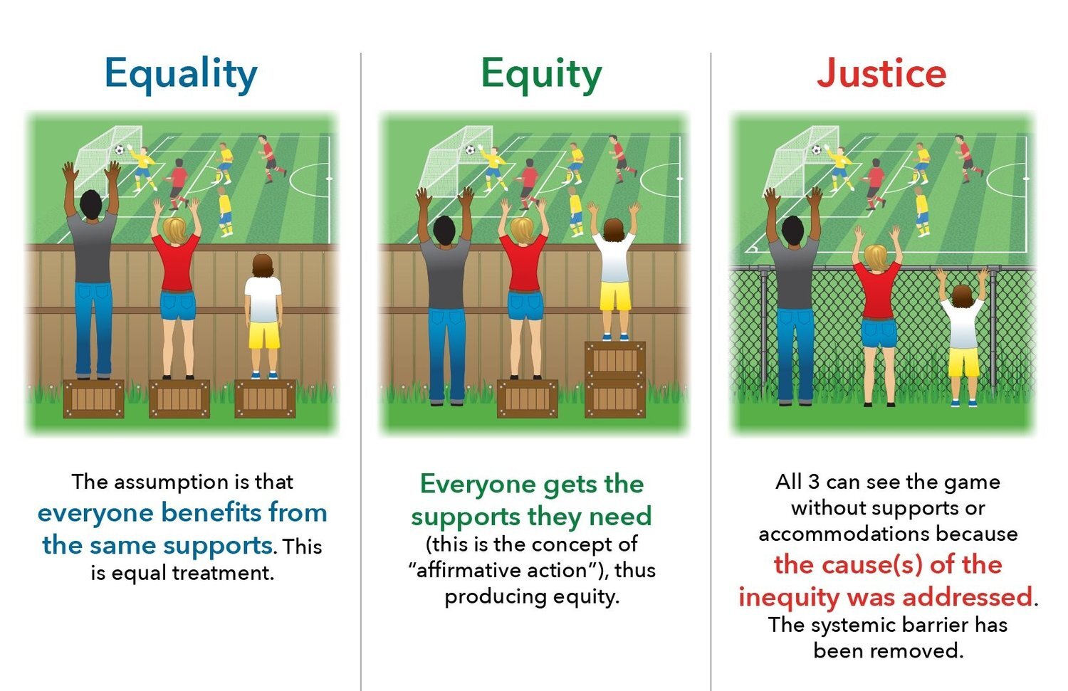
I only taught a small part of the programme, some of the Lean Thinking elective module, but being encouraged to think about the relevance of the pictures on slides, to take extra care in describing what is happening in graphs, charts, made me more careful and considered in my teaching definitely. We didn’t get everything right, there were lots of problems along the way, but together, we worked through what we needed to do to give him the best access to his studies that we could. His journey was always going to be harder than everyone else’s, no matter what we did or didn’t do, because he can’t see. He was so often reliant on other people, he was always going to need more time, more effort, more care. I’m reminded of this drawing which so beautifully, visually, explains how we have to do more to provide equity of access.

Picture 3 in this diagram describes ‘overcoming’ the systemic barrier that the physical difference demands. The innovation of removing the wooden fence liberates access for all. Another term for this is ‘Universal Design’ and I’m a massive fan.
“Universal design is design that’s usable by all people, to the greatest extent possible, without the need for adaptation or specialized design.” Ron Mace – https://universaldesign.org/definition) – it appeals to my Service Design sensibilities massively.
As this How Design for Accessibility Drives Innovation for All article illustrates, there are so many innovations that benefit society at large, which were specifically created to help disabled people overcome challenges. Universal Design provides the ultimate ‘elegant simplicity’.
“Accessibility and usability share key goals — both are concerned with creating an intuitive user experience. By necessity a product that is usable for someone who does not have the benefit of sight, hearing, or mobility must be more intuitive than most”.
Everyone benefits.
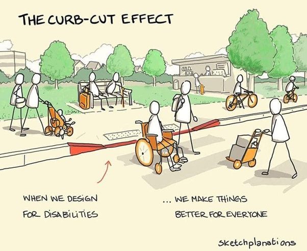
So as the eloquent drawing introducing this blog illustrates, the drop down kerb, whilst essential for a wheelchair user, also benefits the family with a pushchair, the tourist with a wheelie suitcase, the courier with a trolley, the cyclist. And whilst a visually impaired person can’t see this drawing, the act of describing what’s happening in the picture so they can appreciate it as well, helps everyone to understand what is happening, and in turn, gives me a better and deeper understanding too.
- Working Smarter and Harder to Overcome Friction
- Mesmerising Mnemonics
- Recharging Batteries
- Marketing Magic
- What’s My Job Again?
- The Reports Have Gone to Her Head
- Cross Stitch Standards and Creativity
- Hefin David and the Aeroplane Arms
- Hankering for a Handbook
- Window of Light
- Defensive Organising
- McMullin’s Tandem of Co-Production
- The Joy of John Parry-Jones
- The Perils of Disappointment
- The Shield of Shame
- Customer Care and Organisation Innovation
- Hooray for Humanity!
- Angry Lemons
- Double Meanings
- Ticketing Masterplans
- When will it all end …
- Lifetime Loyalty and Taylor Swift
- Looking at Things Differently
- Networking Noodles
- Addicted to Truth
- Designs on Service Design
- The Multiple Joys of Universal Design
- Hungry Cultures
- Event Lean
- The Traffic Analogy
- Moving on Up
- Rosé Cava Revolution?
- Powerpoint Sneaky Lean
- Writing about Writing
- ChatGPT Response: Exploring the Art of Expression: Unveiling the Magic of Writing in the Style of Sarah Lethbridge
- Help to Grow Coldplay Style
- Caring IS Everything!
- Institutional Flapping
- “Just Do the Next Right Thing”
- Trust Thermoclines
- February 2026 (2)
- December 2025 (1)
- November 2025 (1)
- October 2025 (2)
- September 2025 (1)
- August 2025 (2)
- July 2025 (1)
- June 2025 (1)
- April 2025 (1)
- March 2025 (2)
- February 2025 (1)
- January 2025 (1)
- December 2024 (1)
- November 2024 (1)
- October 2024 (1)
- September 2024 (1)
- July 2024 (2)
- June 2024 (1)
- May 2024 (1)
- March 2024 (1)
- February 2024 (2)
- December 2023 (2)
- October 2023 (2)
- September 2023 (1)
- July 2023 (3)
- June 2023 (1)
- May 2023 (1)
- April 2023 (1)
- March 2023 (1)
- February 2023 (1)
- January 2023 (1)
- November 2022 (1)
- October 2022 (2)
- August 2022 (2)
- July 2022 (1)
- May 2022 (2)
- April 2022 (1)
- February 2022 (1)
- January 2022 (1)
- December 2021 (2)
- November 2021 (1)
- October 2021 (1)
- September 2021 (1)
- August 2021 (1)
- July 2021 (1)
- May 2021 (2)
- April 2021 (1)
- March 2021 (1)
- January 2021 (1)
- December 2020 (1)
- October 2020 (3)
- August 2020 (1)
- June 2020 (2)
- April 2020 (1)
- March 2020 (1)
- February 2020 (1)
- December 2019 (2)
- October 2019 (1)
- September 2019 (1)
- August 2019 (1)
- July 2019 (1)
- June 2019 (1)
- February 2019 (3)
- October 2018 (1)
- September 2018 (1)
- March 2018 (10)
- April 2016 (1)
- January 2015 (3)
- July 2014 (9)
- September 2013 (1)
