Learning about contrast
19 June 2024At our most recent Centre for Medical Education Equality, Diversity and Inclusion Committee meeting we were looking at some posters. A colleague mentioned that they found the posters quite difficult to read and talked about the contrast between the text and the background. As often is the case, this prompted me to learn something.
I was reminded about a talk in May I attended by Beth Kume-Holland – the Annual University of Oxford Disability Lecture. Beth Kume-Holland listed four quick wins on the topic of accessible communications:
- Include alt text and image descriptions with any images
- Make sure all video content includes closed captions
- Ensure proper contrast between any text and its background
- Camel Case your hashtags. (#dontbeinaccessible #BeAccessible)
This prompted the question for me: what is proper contrast between text and backgrounds. A web search identified some very useful recommendations and resources.
This Scope website had an article all about Contrast:
It talks about low contrast when colours are too similar (for example, yellow and orange) and high contrast when colours are very different from each other (for example, black and white). A contrast ratio of 1:1 shows no contrast; a 21:1 ratio shows a high contrast, for example black text on a white document. The Web Content Accessibility Guidelines (WCAG) 2 suggest a minimum contrast ratio of 4.5:1 for small text and 3:1 for large text. It describes an optimal compliance suggests a ratio of 7:1.
This site by WebAIM allows a calculation of contrast ratio. You can identify colours from an image using this site. Here is an example of what I have done to calculate a contrast ratio.

Code for the 0range colour: #EEA480
Code for the blue colour: #05427C
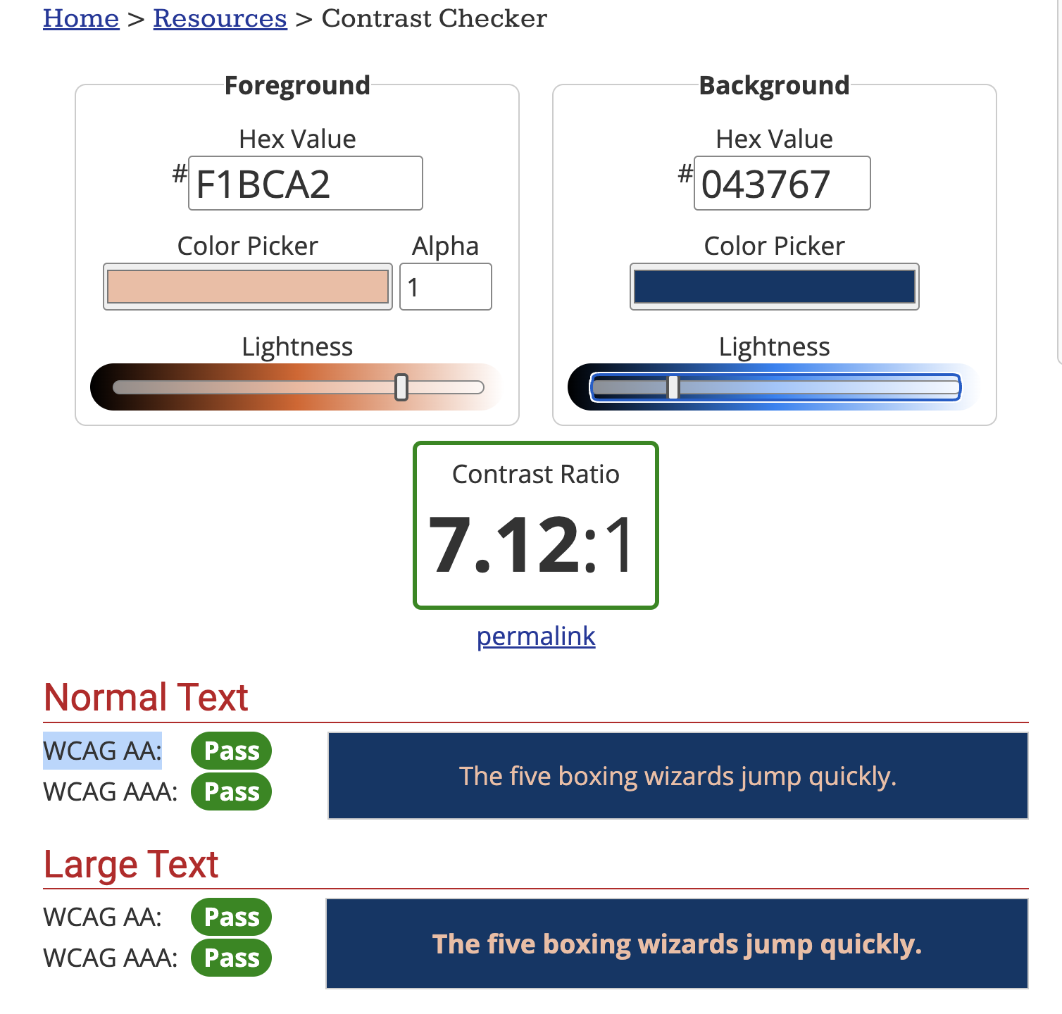
This gives a ratio of 4.93:1 which passes the WCAG AA requirement. To pass the WCAG AAA requirement, the contrast would need to be increased to 7:1. This could be done by changing the lightness of the one or both of the two colours.
Here is what I have tried. I’m not sure how much difference it makes so I need to discuss this with others.
Some more information on these sites too:
- Another article from Scope about accessible fonts and readability
- One about How to write dyslexic friendly web content
- UK Government advice about Accessible communication formats
- UK Government Blog post about Colour Contrast.
- Blog post about Accessible contrast ratios and A-levels explained
- November 2024
- June 2024
- May 2023
- September 2022
- August 2022
- February 2022
- January 2022
- November 2021
- November 2020
- September 2020
- July 2020
- June 2020
- May 2020
- November 2019
- June 2019
- May 2019
- December 2018
- June 2018
- November 2017
- June 2017
- July 2016
- June 2016
- April 2016
- October 2015
- July 2015
- April 2015
- March 2015
- February 2015
- January 2015
- November 2014
- October 2014
- August 2014
- March 2014
- November 2013
- August 2013
- July 2013